Time to go back to the mega-merger of United and Continental Airlines.
With these two giants, it’s been confirmed that the merger has been approved by EU Competition authorities, which just leaves the US Authorities to do their job to approve it – or investigate it.
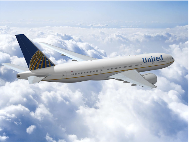
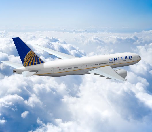
Meanwhile, in honour of this, the graphic designers have their digital crayons out again and have been mocking up up how the merged airline planes will look (if they ever paint them that is – some of United’s Aircraft are still in the Grey/Blue/Orange red scheme…)
So lets play “Spot the Difference”
Merger announcement image mock-up

and the new image
So what have they done? That’s right. Popped a variation of the current United font on the title of the bird, and that’s about it. Or in simple terms “Changed the font”
United-Continental of course spin this out to high heaven. To quote:
“The new visual identity builds upon the significant value of each airline’s current brand, while advancing the combined airline’s future brand image.”
How can I put this nicely? What a load of Marketing claptrap…
