It’s Sunday again so it must be time for some Airplane Art.
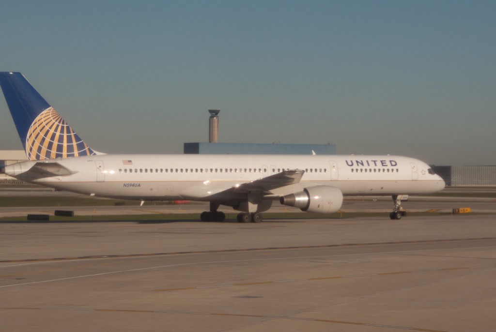
This week, it’s an United Airlines Boeing 757-200 in the “new” colours taxing at Chicago O’Hare International Airport.
With the next trip oncomming, I may have more than my fill of 757’s soon…
More Airplane art of course next week!

My reaction is still, “Wait, that’s a United plane with a Continental tail!”
Trust me, I’m trying to get used to the new scheme.
It isn’t working… 😉
If they did more with the font type, bigger text… Maybe? But that ugly paintshop box CO logo next to the name everywhere else is AWFUL
I reckon this could had been done a lot better. A Billboard type face with the old United Font, streamlining the blue into the gold of Continental.
I guess we’ll have to put up with the new design as “A change we’ll like”