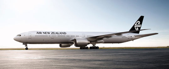
In what can be seen as one of the simpler rebrands of the year, Air New Zealand have decided to abandon the blues and greens it had on its tails, and go for Black and White.
Whilst the famous Koru remains intact instead, it’s now on a black background. The typeface is also “modernised” as well.
Well. It does look smart. Also probably a lot cheaper to paint on too… and to be honest – quite boring.
Expect this to be rolled out across all Air signage and communications channels by the end of the year, with planes to follow.


I kind of like it. Understated, yes, but that tail will be able to be picked out at a mile.
Boring with a capital B. Hmmm…black and white….maybe less color is being more “green” ??
Also interesting to note the similarities in color to the star alliance logo jet!
Well, NZ have managed to make their livery a lot more boring.
It’s sort of like a Star Alliance logotjet with a different logo on the tail and a different name on the fuselage.
Very boring indeed. Black is our nations sports colour but I think the blue and green is a much better represenation of NZ. It is a very green country and surrounded by very blue sea! Not inspiring at all.