So Air Canada has gone for a new livery on its planes.
And… without further ado, here it is. Those expecting something exciting should look away now.
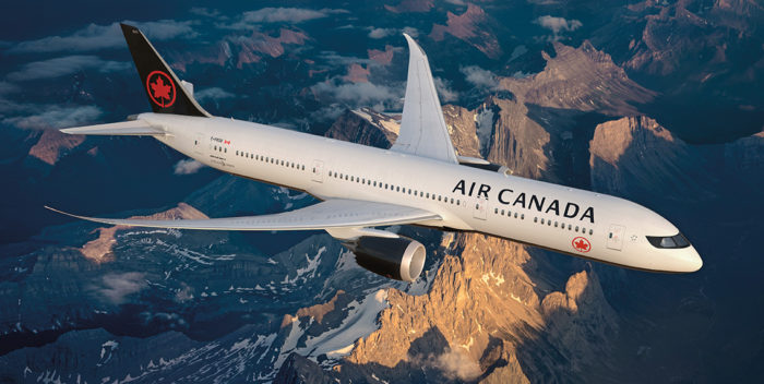
Air Canada New livery on a Boeing 787 – Images, Air Canada
Well, there’s white, black and a bit of red for the Air Canada logo. The maple leaf (part of Air Canada’s livery) is back in a rondel after some years. On the belly of the plane, there’s a lot more black paint, with the rondel on the bottom
Let’s go into the magical world that is PR.
Our new livery signals another pivotal transition point in our 80-year history and celebrates a major branding project for a globally recognized Canadian company. Together with our new uniforms, improved international cabin standard and enhanced on-board products, the future of Air Canada represents the strength of our nation and the future-looking spirit of our airline through distinct references to Canadian culture, heritage and evolution. From small regional airports to major international hubs, wherever we land, we fly the flag with care and class.
Righht. Air Canada goes on to say
With the new livery design, our airline firmly reasserts itself as Canada’s flag carrier, proudly displaying the Air Canada Rondelle on a global stage, while making Canadians feel at home.
The new livery balances national identity with a compelling design that clearly accentuates the features of each aircraft, allowing it to elegantly stand out in the sky and on the runway.
For those of you who are students of design will love some of the design notes in the new style guide.
Here’s the evolution of the Air Canada tail (thanks to Edward Russell at Flight who tweeted this).
Air Canada tails through the decades, including the latest iteration: pic.twitter.com/u2EAZPfWwm
— Edward Russell (@e_russell) February 9, 2017
.
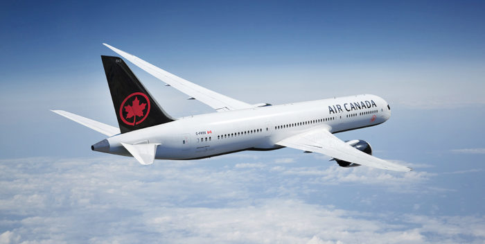
The plane has been revealed today (and looks a bit better than the images above).
Here is @AirCanada‘s new livery. What do you think? #FlyTheFlag
Yawn, spend a bunch of money to come up with something bland and vapid…….what is it that makes airlines such a soft touch for branding consultants.
Generally with a brand you want something recognizable and distinctive – which is exactly what the previous livery was.
For your info fleet needs to be repainted every 10 to 15 years. So it is time for old paint to be removed anyway.
There was nothing wrong with the old style. They could have invested that money back into their customers.
This is actually quite a nice livery. The only trouble is, the pre-existing livery was one of the finest in the skies.
It’s nice to see the roundel back, but I don’t think it was worth the trade-off.
Hmm.. Delta-Like
I hope they didn’t spend much money on that.
West coast Canadian here. Doesn’t work for me at all. Delta-but-black does not symbolize “Canada” in any way shape or form.
The return of the Rondelle is a nice touch, however, so all isn’t lost.
It seems I’m in the minority, but I think it looks really sharp. I loved the ’64 – ’92 livery, and this feels like that’s been smartened up a bit. I also really disliked the dot-matrix meets spearmint-toothpaste livery that this replaces.
I love the cockpit “mask” in black. I wonder if they were inspired by the A350?
Also, there aren’t many airlines with black underbodies, so it should make spotting AC flying into LHR a little easier…
I am joining the minority:) Like new livery a lot! Very nice style, sharp and neat!
Olga, we’re not alone:
http://www.underconsideration.com/brandnew/archives/most_unapologetic_thing_canada_has_done.php#.WJ3kBFOLRtQ