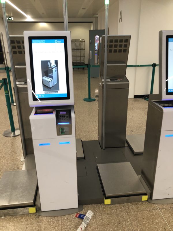
I decided when checking in my Aer Lingus flight today – I would try the new Self Check-In kiosks at Birmingham Airport
These baggage weighing, take money, print boarding passes.
As the queue was a little long (and I still love paper boarding passes), I decided to check in.
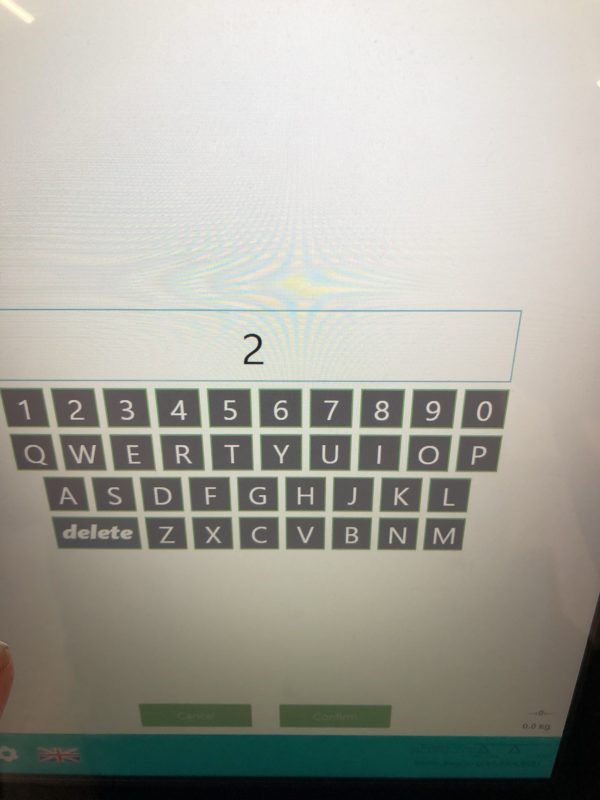
First thing it asks is your Passenger Name Record (PNR). I was then presented with this UX nightmare.

Keyboard on a Rockwell Collins Self Check-in screen.
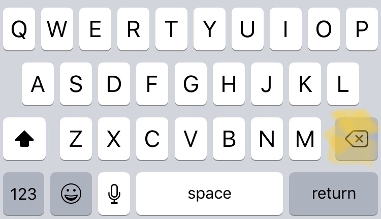
We all use keyboard on a day to day basis (be it physical or virtual) and normally… these are right hand side

Apple iPhone standard keyboard
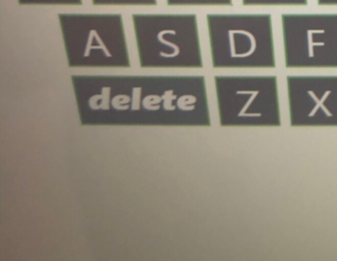
So why the heck do they put the delete button in the bottom left of the virtual keyboard????

Seriously – who puts a delete key in the bottom left on a keyboard?
Why does this matter? By human nature, we have got used to layouts of keyboards. As such, when you have to spend 10-15 seconds hunting for a button, it increases the check in time.
Which negates the point of these machines – to reduce costs and reduce check-in times.
Next time – a little more design effort please?
(and yes, its a Rockwell Collins system according to the media release from Birmingham Airport)
Welcome to Economy Class and Beyond – Your no-nonsense guide to network news, honest reviews, with in-depth coverage, unique research as well as the humour and madness as I only know how to deliver.
Follow me on Twitter at @EconomyBeyond for the latest updates! You can also follow me on Instagram too!
Also remember that as well as being part of BoardingArea, we’re also part of BoardingArea.eu, delivering frequent flyer news, miles and points to European readers

Wait, what?! As a UX professional I can see why the designer might have done this: Put the delete key on the other side and it looks, at first glance, like a return/enter key.
The designer here was obviously caught between a rock and a hard place – put the delete key on the side users expect to find it and they won’t find it becaise they’ll think it’s an enter key. Put it on the other side and they’ll have trouble finding it because they’ll think it’s a shift key. I’m guessing this designer thought that putting it on the left was the lesser of two evils as there’s very little more frustrating than typing in a number, checking you’ve done it correctly, and then accidentally deleting bits of it with what you thought was an enter key.
Airports suck and the reason most people feel uncomfortable in them is that, from start to finish, they are UX nightmares but you chose to focus on one little thing that you thought was wrong without considering where any possible solution might lead.
Next time – a little more thinking effort please?