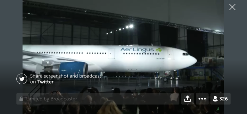
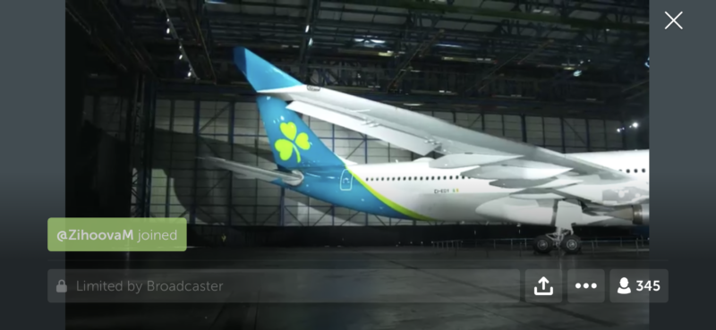
… and well – here is the new Aer Lingus livery. I’ll leave it here for you to mull over your thoughts.
As announced at APEX Expo 2018, it’s part of the new airline strategy as it continues to welcome passengers arriving, departing or connecting through its Irish Hubs.
I’ll spare you the fluff that was in the Periscope feed (because there was some marketing fluff is… well. awful).
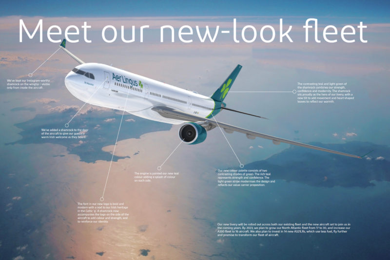
In terms of livery, according to the airline:
- Aircraft Doors –We’ve added a shamrock to the door of the aircraft to give our guests a warm Irish welcome as they board.
- Brand mark – The font in our new logo is bold and modern with a nod to our Irish heritage in the Celtic ‘g’. A shamrock now accompanies the logo on the side of the aircraft to add colour and strength, and to reinforce our identity.”
- Engines – The engine is painted our new teal colour to bring colour to the aircraft.
- Winglets – We’ve kept our Instagram-worthy shamrock on the wingtip – visible only from inside the aircraft.
- Swoosh- Our new colour palette consists of two contrasting shades of green. The rich teal represents strength and confidence. The light green stripe modernises the design and reflects our value carrier proposition.
- Tailfin – The contrasting teal and light green of the shamrock combines our strength, confidence and modernity. The shamrock sits proudly as the hero of our livery, with a new tilt to add movement and heart-shaped leaves to reflect our warmth.
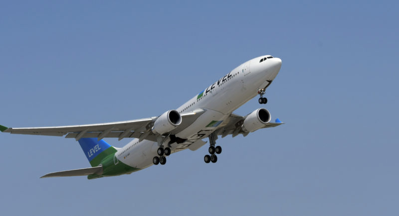
So, what do we have? Well, at least the Shamrock is there. That’s a good thing to see. The font looks like something spare in the fontographers toolkit, and the classic shades of green are gone sadly – rather, we have a livery that’s more like IAG compatriot airline LEVEL.

Like peas in a pod – LEVEL Airbus A330 – Image, LEVEL.
The first plane painted in the new livery is EI-EDY – an Airbus A330.


Images, Aer Lingus via their Twitter/Periscope feed.
An Airbus A320 – EI-CVA – has also been painted in the new livery.
The new livery will be rolled out gradually until 2021. All new aircraft joining the fleet (including the Airbus A321LR which will feature a full two-class cabin).
As for the uniform refresh – that’s on the card still too, with the airline working with Irish designer Louise Kennedy on the new uniforms.
If you want to read the full fluff, it’s at https://www.aerlingus.com/travel-information/aer-lingus-news/brand-refresh/
It could have been worse. But it will be sad seeing the green go
Let’s face it – there could have been a lot more white on this plane, but at least the airline retains its part of its core identity – the shamrock. However, that distinctive green on an aeroplane that you see at airports will start to fade soon.
And that’s saddening – as much as the shamrock was its identity – the green was too.
But welcome to the march of progress.
Welcome to Economy Class and Beyond – Your no-nonsense guide to network news, honest reviews, with in-depth coverage, unique research as well as the humour and madness as I only know how to deliver.
Follow me on Twitter at @EconomyBeyond for the latest updates! You can also follow me on Instagram too!
Also remember that as well as being part of BoardingArea, we’re also part of BoardingArea.eu, delivering frequent flyer news, miles and points to the European reader.

Wow, the press release is ridiculous. How the hell does a two-colour swoosh communicate a “value carrier proposition”? Many carriers that consider themselves “value carriers” go for bold colours (WOW, Spirit in the US, etc).
“We’ve added a shamrock to the door of the aircraft to give our guests a warm Irish welcome as they board.” Sure, because the bright green of the old livery didn’t communicate “Ireland” very well.
The neo-Celtic “g” is a nice touch, I like that bit. But overall it’s just bland and unimaginative.
Maybe they spent too long looking at Joon PR’s 😉
Hmmm – Eurowhite strikes again
And a swoop too.