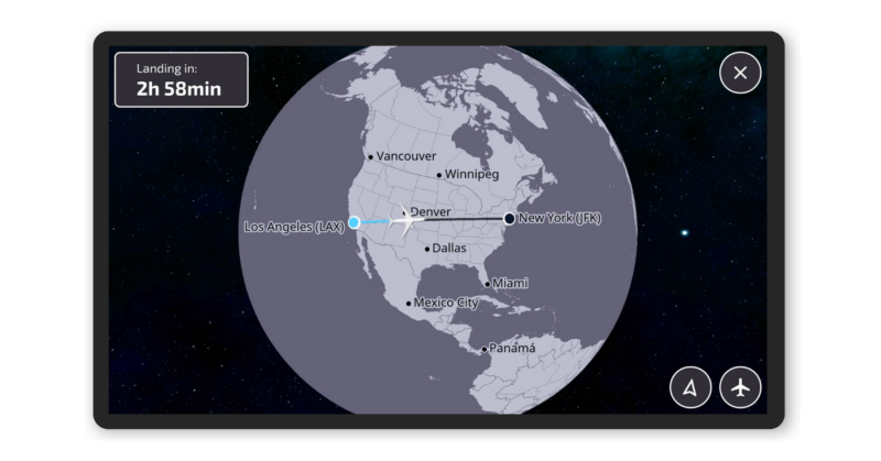
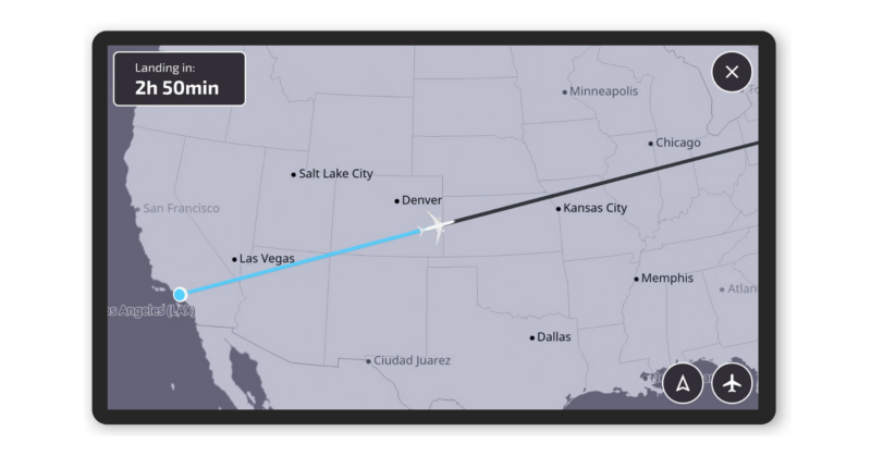
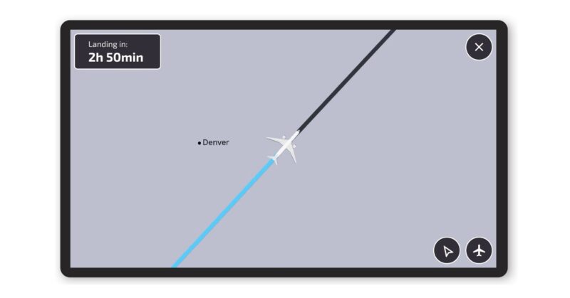
With accessible travel being an ever-growing theme, FlightPath 3D has introduced its Accessibility Map.
This simplified high-contrast display is designed for travellers with visual, motor, and/or cognitive impairments. This map extends the existing FlightPath3D offering, prioritizing accessibility while providing the key features passengers expect.
It features high-contrast displays, larger visuals, and flexible navigation controls. The interface is built to standards set by Web Content Accessibility Guidelines (WCAG) 2.2 to ensure regulatory compliance. whilst being able to provide entertainment and information for travellers.
The map promises major cities and borders to reduce clutter and increase the readability of the display. High-contrast visuals are combined with a palette that caters to colour-blind users, adding patterns and textures to distinguish elements in the map.
Airlines can customise this, with options around text and icon sizes
The company has a roadmap to expand the accessibility with audio narration in 2025 via its AI-enabled assistant – Luci.
In Quotes
FlightPath3D President Duncan Jackson said:
“Every traveler, regardless of background, age, or ability, should have easy access to important details about their flight and enjoy the fun of tracking their plane as they fly,”
“We recognize the importance of creating an inclusive inflight experience and the Accessibility Map, featuring a streamlined interface and visibility enhancements, is a major step toward our goal of providing maps for all passengers.”
Deployment
The Accessibility Map is available for airline selection today. The first customer deployment is expected to be active in Q1 2025.
Increasing Accessibility
We’ve covered more than a few innovations in the past that help with accessibility in the air, and it is good to see that vendors recognise this as they seek to work with Passenger with Reduced Mobility legislation, as well as understand how to leverage their products to allow them to be more inclusive.
Having a simplified interface to one of the larger sources of information on a long-haul flight – the map, is a wonderful thing to see, as operators seek to understand how to deploy accessible technology in the air.
And if it improves the passenger experience on the way – so much more the better.
Images – FlightPath 3D
Welcome to Economy Class and Beyond. Your no-nonsense guide to network news, honest reviews, in-depth coverage, unique research, as well as the humour and madness I only know how to deliver.
Our Social Media pool has expanded. You can find us across most networks as @economybeyond on Twitter, Mastodon, BlueSky, Threads and Instagram!
Also, remember that we are part of the BoardingArea community, bringing you the latest frequent flyer news from around the world.


