Amazingly, its a Sunday Soapbox entry… on a Sunday!
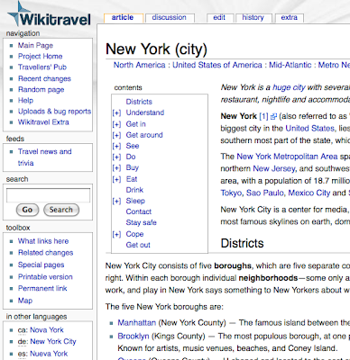
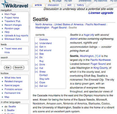
Today, I’m taking a sideways swipe at Travel guides and how many of them really quite frankly have had been designed by a programmers state of mind, or that it’s a direct lift of WikiTravel (and that’s not a complaint against WikiTravel – it’s a very good resource on where to go, what to see and what to avoid.)
My travel apps screen. Apply low taste here.
Lets compare and contrast some Apps….
Travelto’s New York City
Hang on a second.. this listing method vaguely familiar….
Well. Score 1 for layout, but minus 1000 for originality eh? Totally WikiTravel Derived. NEXT!
– Explore Seattle
Oooh. tempting front. However, scratch the surface….
Hey… familiar text here.
Even more useless as it misses the a lot of the content from it! Classy! NEXT!
Lonely Planet’s San Francisco
Dread the though – some original writing at last!!!! But although content is better than some with their own opinions.. the user interface is… atrocious.
Definitely a lift from their book – which isn’t bad at all. What does bug me is the lack of User Interface testing. For example, flicking from page to page can have… odd results.
Ok, yet anohter San Francisco application (thank you Apple for hosting your big events there)
Ok, it’s a stab and hit interface, that allows you to fiddle around. Whilst light on information, it’s pretty reasonable. But the stab and hit interface is fiddley at times. The net result is its a pain to navigate.
Oh – and the Paris2Go application. One word. Wikitravel.
In some cases it’s worth just printing the WikiTravel page you need and be done with it. Need it electronicly? Use a PDF Writer to generate a PDF of the information then upload it onto your device.
My main comment: If you’re going to write an Travel Guide App make sure it’s original – not a lift from WikiTravel – and USER TEST IT THOROUGHLY!.

 vs Wikitravel
